
Dead clicks in Microsoft Clarity provide insights into areas where users may struggle with site usability, which certainly is a piece of E-E-A-T. This short guide explains dead clicks, how to interpret their data, and ways to turn this information into actionable improvements.
What Are Dead Clicks?
- Dead clicks occur on non-interactive webpage elements
- Dead clicks indicate mismatches between user expectations and site functionality
- Sometimes, dead clicks are noise
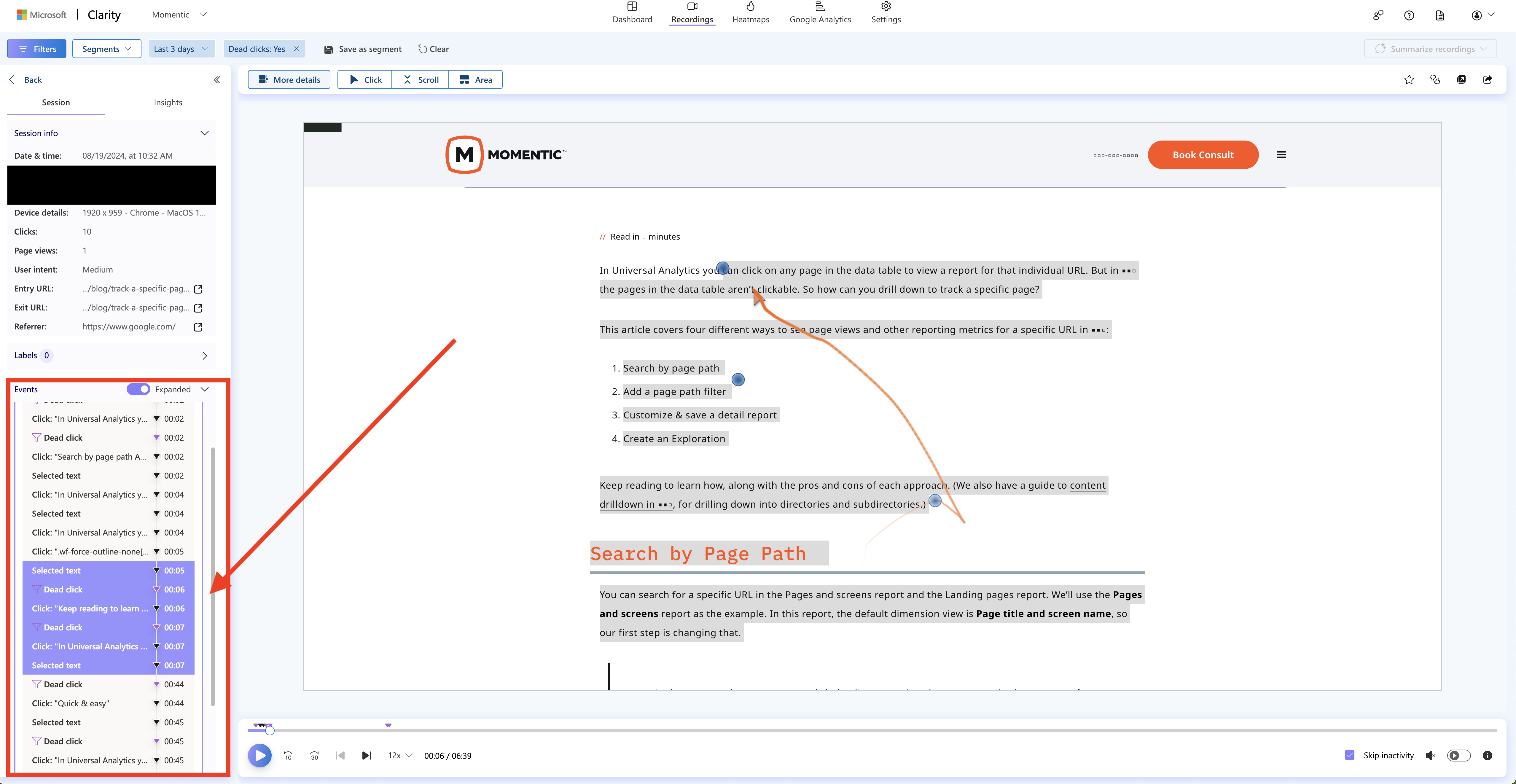
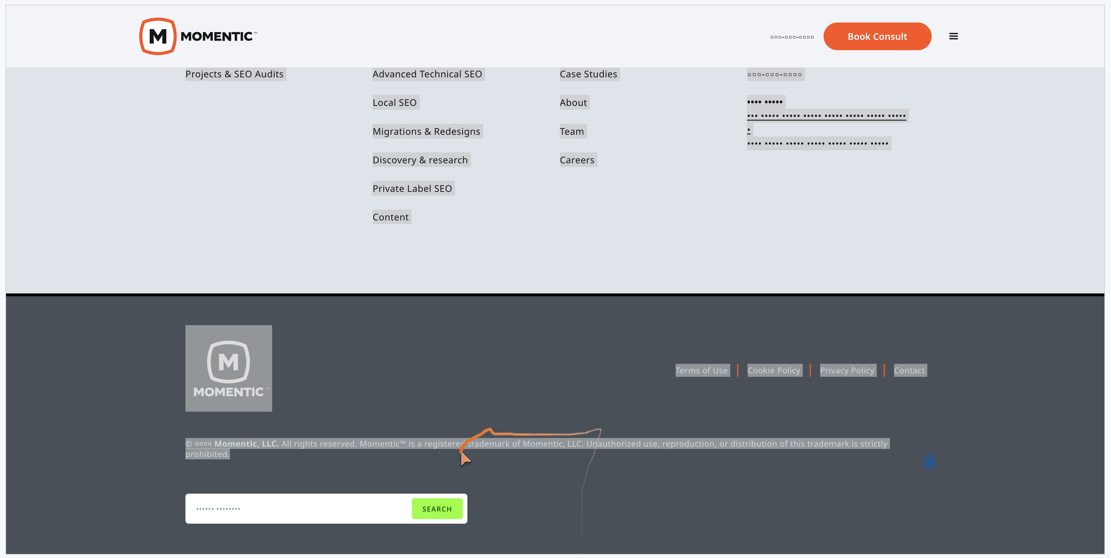
Dead clicks occur when users interact with non-interactive elements on a webpage, like plain text, static images, decorative elements, or any area not designed to respond to clicks or taps.

What Do Dead Clicks Mean?
Dead clicks often indicate a mismatch between user expectations and website functionality.
Why You Should Care About Dead Clicks
Dead clicks signal gaps between user expectations and site functionality, often caused by misleading design elements or inadequate content. Analyzing dead clicks can identify UX problems and improve user flow, making the site more intuitive. Based on my experience, about 90% of dead clicks highlight opportunities for UX improvement.
Interpreting Dead Click Data
- Causes: misleading design, user information needs, accidental clicks
- Analysis: look for patterns, manually review session recordings, objectively consider user intent
Dead clicks can stem from various factors, but these two are the most common:
- Misleading design elements might appear interactive when they're not, leading to user confusion.
- Mobile users might generate dead clicks accidentally due to small tap targets or closely spaced elements.
Sometimes, dead clicks reflect user confusion about site navigation or structure. We don't cover that in detail here, but if you find specific patterns, like users clicking on certain areas hoping for more information on a particular topic, this is a strong sign that you’re missing content that could be valuable to them.
Plan to spend 4 hours manually reviewing session recordings to understand what users were trying to do before they clicked. This can help reveal misleading design cues or show where users want more information. Then, allocate 1 hour to write up a report with your findings.
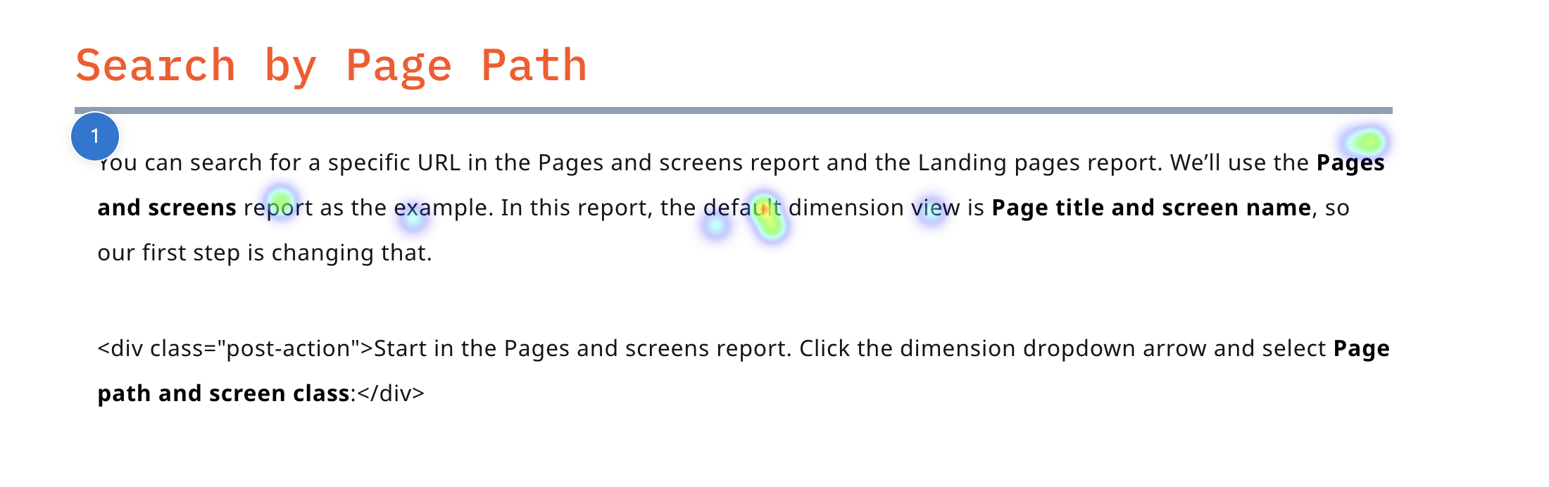
Examples of Helpful Dead Click Data
Addressing Dead Clicks
- Prioritize: frequent clicks, user frustration, potential for improvement
- Strategies: distinguish non-interactive elements, add functionality, expand content
- Monitor: track metrics, consider A/B testing
Not every dead click needs a fix. Focus on the ones that matter—like frequently clicked elements where users expect interaction or areas causing frustration. Then, look at places with consistent dead clicks where adding functionality or content could help. Ignore isolated or accidental clicks.
To address dead clicks, make sure non-interactive elements don't look clickable. If users keep clicking on something static, consider adding functionality or more content. For mobile, larger and better-spaced tap targets help avoid accidental clicks. Radio buttons on mobile are a common culprit because they're often too small, leading to unintended clicks. Be sure to analyze desktop and mobile data separately.
Try to group sessions into intent buckets to better understand user behavior. After changes, analyze your key behavioral metrics. For larger updates, consider A/B testing to better understand what “improvement” means.
Limitations and Considerations
- Not all dead clicks indicate problems
- Consider dead clicks alongside other UX metrics
- Combine with other analytics for broader insights
More than dead click data is needed to give the full picture. Combine it with other UX metrics like engagement rates and session duration to understand user behavior more clearly. Since clicks don't always show user intent, mix dead click data with tools like heatmaps, surveys, or user research to uncover deeper insights into what users are trying to achieve.
Using Microsoft Clarity
- Key features: heatmaps, session recordings, filters
- Use Clarity as part of a broader UX strategy
Microsoft Clarity has features that help break down dead clicks. Heatmaps show where dead clicks happen on the page, while session recordings give context by showing what users were doing before and after. You can also use filters and segments to focus on specific user groups or behaviors.
On a side note, I think MS Clarity is now the most underrated tool for digital marketers. No one talks about it, but it’s free and packed with incredible features designed to help you improve your website. If you’re not using it yet, you’re missing out on great data that you can use to iterate your website and improve the overall user experience over time.
What Now?
Analyze Dead Click Data
- Review session recordings for 4 hours to identify patterns and misleading design elements.
- Allocate 1 hour to document findings and prioritize high-impact areas (e.g., frequently clicked non-interactive elements).
Implement Changes
- Adjust designs to clearly distinguish non-interactive elements from clickable ones.
- Add functionality or content where users expect interaction.
- Make non-functional sections look like they are non-functional.
Monitor Impact
- Track key metrics and run A/B tests to measure effectiveness.
- Combine dead click data with heatmaps and other UX analytics to refine future improvements.
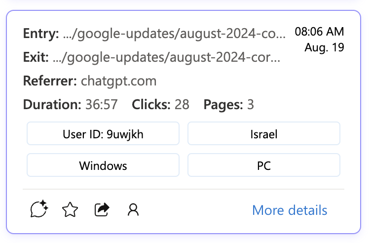
Update
As a followup, I wrote an article about: How to Use Dead Click Data to See How Often People Are Plagiarizing Your Content With ChatGPT. Here's a few from sessions on the Momentic website within the last 10 minutes (42 different people have done this within the first 8 hours of the day).
this text

